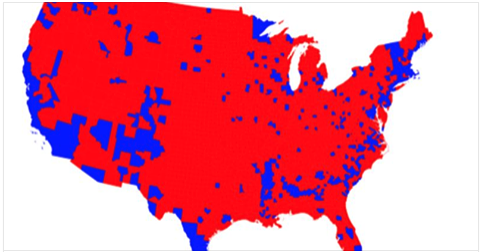
If you follow any conservatives on social media (and if you’re a liberal you really, really should) you may have come across one of the current talking points relating to the ongoing discussion about the Electoral College: maps. Such blazing red maps! Like this one:

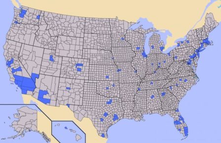
I saw that on Facebook, linking to an article called “What Elections Would Look Like WITHOUT Electoral College” [sic], from a site called The Federalist Papers Project. Oddly—one might even say suspiciously—that article doesn’t actually include that map, though it does include this one:

That’s a map of population density; the most populated counties are in blue. “Now, if the Electoral College did not exist, what would happen to the grey counties?” the author asks. “They would be forgotten, they would not matter. Only the most heavily populated areas would be courted for votes.”
The implication, of course, is that the Electoral College is in place to protect the gray/red counties (read: Real Americans) from the decisions made by those in the blue counties (read: Kale-Munching Freedom-Haters). And there’s really only one problem with this idea:
It’s complete, unadulterated, one-hundred-percent-free-range horseshit.
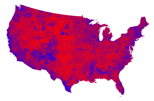
Of course, the reasons why it’s horseshit are many. First off, let’s deal with the subtext, especially the subtext of that incredibly misleading, Facebook-friendly teaser image. What the article is clearly implying is that the gray counties are actually red, which is to say conservative, while the blue counties are full of true-blue liberals. But unfortunately for the author, reality doesn’t quite agree. Here’s a map of how counties actually voted in 2016, per info available as of November 10:

(Longtime readers may recognize this as being similar to the one in my Purple Nation post from 2008, and it comes from the same source. I strongly encourage you to read that whole page if you want a sense of how the country actually votes.)
Looks an awful lot less red, doesn’t it? That’s because this map uses a gradient from blue to red rather than, say, marking a county that voted 50.001 percent Republican full red and a county that voted 50.001 percent Democrat as full blue. The result? Look at all that purple! And as I said eight years ago, purple is good:
It means we have people of differing political opinions living right next door to each other. When President-elect Obama takes office in January, he should have a mural of this exact map hung in the Oval Office—a constant reminder that he’s not working for one group or another, but for everyone.
(I’d suggest Mr. Trump do the same thing except I’m not certain he knows how to read maps.)
Second, let’s look at another of the Federalist author’s implications: that since there are more non-blue counties than there are blue ones, if the blue counties get their way it’s inherently unfair. The trouble with this idea is that elections aren’t decided by counties; they’re decided by people. And if there are more people in the blue counties than elsewhere, then them getting what they want is exactly fair.
In fact, this author’s defense of the Electoral College has the issue entirely backward. The Electoral College gives those gray-or-red counties an unfair advantage over the blue ones, and here’s why: Electoral College numbers are dictated by the number of senators and representatives assigned to a state. (Plus three for D.C.) A state’s number of representatives is determined by population, but—and this is the important bit—every state gets two senators no matter the population. Therefore, states with very low populations (which tend to be rural, which tend to vote conservative) get an edge in electoral votes in comparison to the population. This is why two of the last five elections have appointed Republican presidents in spite of many, many more people voting for the Democrat. (Secretary Clinton’s lead in the popular vote is up to about three times the population of Wyoming as of this writing.)
Population numbers and math can quantify this (see here). When we run the numbers we see that 35 states have a number of electoral votes that outweighs their population (36 if you count Tennessee’s razor’s edge). Twenty of those voted Republican in 2016, bringing in 121 electoral votes for Mr. Trump, or 132 counting Tennessee. The other 15 “outsized” states brought 90 electoral votes to Secretary Clinton.
In other words, to make a very long and mathy story short, it’s the less-populated parts of the country—those gray counties—that have the unfair edge, and if the Electoral College is supposed to prevent such things from happening it’s doing a very bad job.
Finally, let’s talk about the idea, bandied about often in conservative circles and alluded to in the Federalist article, that those blue counties don’t represent “real America.” (Because why else would it be a problem for a greater number of people to have a greater impact in the electoral process?) My response to this idea will be much more succinct, I promise you, because it can be summarized in three words:
Go fuck yourself.
Real America is the immigrant with the newly minted citizenship papers as much as it is the weathered plains-state farmer. Real America is the gristly New York punk rocker as much as it is the Mississippi preacher. Real America is the newly married urban lesbians just as much as it is the suburban soccer mom. Real America is the Clinton voter just as much as it is the Trump voter, because there’s no such thing as “real” America—”real” America is America, with all its glories and failures, and you don’t get to decide who is and isn’t a “real” American.
You don’t get to decide. What you do get to do is vote, like we all do. The problem is, this year more than one in a hundred of those votes, 1.5 million and counting out of about 135 million, were ignored thanks to the Electoral College.
One hopes that the red-map-waving Electoral College defenders would feel just as strongly about this issue if they ever found themselves on the other end of this equation. But I wouldn’t count on it.
